
Most of your customers will meet your business on a phone first. They tap a search result between errands, check your hours from the car or look for your number while standing in a parking lot. If the page is tiny, slow or hard to tap, they go back and pick someone else. This guide explains what a mobile-friendly website really means for a small business, how to test yours in a few minutes and what to fix first. It is written for owners in Laurel, across the DMV and anywhere else who want more calls and bookings from mobile visitors.
What Makes a Website Mobile-Friendly?
A mobile-friendly website is one that is easy to read and use on a small touchscreen without pinching, zooming or hunting. In practice that usually means a responsive design that rearranges itself to fit any screen, text that is readable at normal size, buttons with enough space around them and pages that load quickly on a cellular connection.
It also means the mobile version contains the same important content as the desktop version. Google explains that it mainly uses the mobile version of a page for indexing and ranking, an approach it calls mobile-first indexing. If your phone layout hides service details, reviews or location information, that content may not help you in search.
Why Mobile-Friendly Design Matters for Small Businesses
- First impressions happen on phones. A cramped or broken layout makes a business look out of date, even if the work you do is excellent.
- Local searches lead to action. People looking for a nearby service often want to call, get directions or book right away. Every extra step loses some of them.
- Search visibility. Because Google looks at the mobile version of your site, mobile problems can hold back your rankings. Our guide on how to rank a small business website on Google covers the other essentials.
- Ads and social traffic. Most clicks from social media and many paid ads land on phones. Paying for traffic that hits a hard-to-use page wastes budget.
How to Test Your Website on a Phone in 10 Minutes
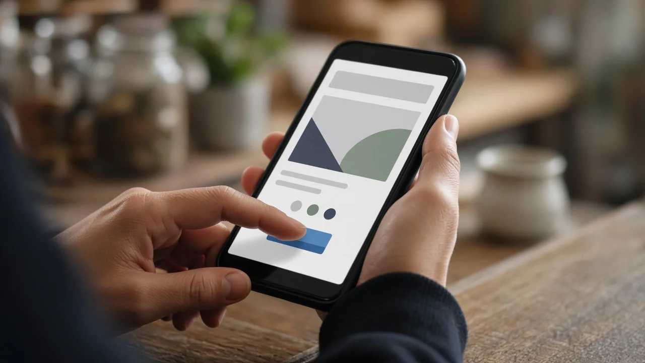
You do not need special tools to spot most problems. Grab your own phone, turn off Wi-Fi so you are on cellular data and try to act like a new customer:
- Search for your business and one of your main services, then open your site from the results.
- Find your phone number and tap it. Does it start a call?
- Open a service page. Can you read it without zooming?
- Fill out your contact or quote form and submit it. Did the message actually arrive?
- Open the menu, go to two or three pages and come back to the homepage.
- Try it on a second device, such as a family member’s phone or a tablet, if you can.
For a more technical view, run your key pages through Google’s free PageSpeed Insights tool and choose the mobile results. It reports on Core Web Vitals, Google’s measurements for loading speed, responsiveness and visual stability, and suggests what to improve.
Mobile-Friendly Website Checklist for Small Businesses
1. Use a responsive layout
A responsive layout adapts to the screen instead of showing a shrunken desktop page. Columns stack, images resize and menus collapse into a simple button. Most modern website themes are responsive, but customizations and old page builders can break that behavior, so check every template you use.
2. Put the next step within thumb’s reach
Your phone number, a call button and a clear booking or quote button should be easy to find on every page. Use tap-to-call links so visitors do not have to copy and paste a number. A local home-services company such as Alomo Cleaning Services depends on customers being able to request a quote from a phone in under a minute, and most service businesses are no different.
3. Make text readable and buttons tappable
Use a comfortable font size, good contrast between text and background and short paragraphs. Give buttons and links enough space so a thumb does not hit the wrong one. These choices also support visitors with low vision or limited dexterity; the W3C’s introduction to web accessibility explains why that matters.
4. Keep pages fast
Large images, auto-playing video, too many plugins and heavy pop-ups are common causes of slow mobile pages. Compress images, use modern formats such as WebP, limit third-party scripts and choose reliable hosting. Speed is one of the easiest wins once you know what is slowing things down.
5. Simplify forms
Ask only for the information you truly need. Use the right field types so phones show a number pad for phone numbers and an email keyboard for email addresses. Make sure error messages are clear and the form confirms when it has been sent.
6. Avoid intrusive pop-ups
A pop-up that covers the whole screen on a phone, with a tiny close button, is one of the fastest ways to lose a visitor. If you use pop-ups, keep them small, delay them and make them easy to dismiss.
7. Keep content consistent across devices
Do not strip out important details on mobile to make pages shorter. Use headings, accordions or tabs to organize longer content so it is still there for visitors and search engines. Make sure your name, address and phone number match your Google profile; our Google Business Profile optimization guide walks through that step.
Fix It or Redesign?
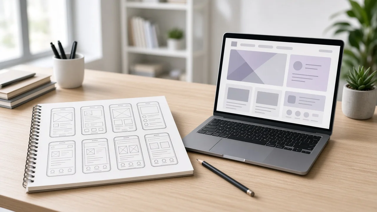
Some mobile problems are quick fixes: a broken button, an oversized image or a form that sends to the wrong inbox. Others point to a deeper issue, such as an old theme that was never built for phones. If you are patching the same problems again and again, review our list of signs your website needs a redesign. When you do rebuild, our website launch checklist for small businesses helps you go live without losing pages that already bring in traffic.
How MastermindGOC Can Help
MastermindGOC LLC’s web design and SEO service builds websites for small businesses that look professional on every screen and are set up to rank on Google. We review how your current site performs on phones, fix what is holding it back or design a new responsive site, and connect it to clear calls to action so mobile visitors become customers. We are based in Laurel, Maryland, work with businesses across the DMV and serve clients worldwide.
Frequently Asked Questions
How do I know if my website is mobile-friendly?
Open it on your own phone and try to call, read a service page and submit your form. Then check the mobile results in PageSpeed Insights for speed and usability suggestions.
Is a responsive website the same as a mobile-friendly website?
Responsive design is the most common way to make a site mobile-friendly, but it is not the whole picture. A responsive site can still be slow, hard to tap or missing a clear call to action.
Do I need a separate mobile website or an app?
For most small businesses, no. One responsive website that works well on every device is simpler to maintain and keeps all your content and search signals in one place.
Can MastermindGOC work on websites outside the DMV?
Yes. We are based in Laurel, MD, and work with clients in the DMV and around the world.
Ready for a Website That Works on Every Phone?
If your website is hard to use on mobile, let’s fix it. Call +1 240-639-2059, email info@mastermindgoc.com or reach us through our contact page to get started.